HOME | DD
 the-chocoholic-girl — Angel's Butterflies

Published: 2008-08-12 15:01:43 +0000 UTC; Views: 5607; Favourites: 167; Downloads: 117
Redirect to original
Description
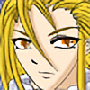
Sakura:"Come with me. Take my hand, and I'll show you what true happiness is."--------------------------------------------------------------------------
01/10/08 edited. fix everything there is to fix [but u probably wouldn't be able to tell the diffrences
 ]
]my contest entry for [yess . . i'm a contest maniac
 ]
]her manga 'angel sphere' character's, sakura.
i tried a new style for the drawing and the coloring. i never draw girls with eyes this big
and the colors . . i've downloaded, like , MANY tutorials for this . .and this is the first time i drew a background!!

again people, show me some critics!!

don't mind my little ol' heart. it's as hard as steel!! hehehe
")
Related content


Comments: 217

I love this pictuer so much Id like to borrow it. If you do allow me I will tell who made it and will not clame anything. Thanks anyway.
👍: 0 ⏩: 1

may i ask what is for?
you have my permission though, but please put a credit if you don't mind.
👍: 0 ⏩: 1
I made a roleplaying game and is playing an Angel and I fell in love with your pictuer so Im gona let your amazing pictuer be modell for my character so others can see her ^^ I have posted a link on the site to ^^
👍: 0 ⏩: 0

thank youuuu~
i'm happy you think so!
👍: 0 ⏩: 1

Advanced critique, huh?
Now, I really like this piece (not as much as your second entry though  (Smile)")
(It's a bit long, so please bear with me!)
Anatomy: The face shape is nicely drawn and the shading on her face is nice and sleek. Most people have already commented on the eyes and how they're disproportionate. The problem isn't your style, they're fantastic eyes, they just look too close together because of their size. A general rule is that the space between the eyes is approximately the size of a third eye and your space is about half of that. In anime, you can bend that rule a little, but don't overdo it. Also notice how your eye outlines are a bold black when the rest of your drawing doesn't have a strong outline. It causes the eyes to appear like they're on top rather than in her skull, so you may want to soften that a little. That's just personal preference, so it's up to you.
Her right arm (the one extending to the viewer) is awkwardly positioned as it looks like her hand is attached almost onto her shoulder. Even at full extension, a little more of the arm is visible. Since her arm is relaxed slightly, more of the elbow should be seen. Another person commented on the finger lengths being level and I see you have already corrected for that.
Dang, I'm lovin' the hair though! You really got a knack for getting it to flow in interesting shapes!
Clothes: You really got a nice sense of fashion and general understanding of folds! I especially like the lace on her shirt, the see-through effect really adds a great touch! The black lace on her arm is a bit strong, so if you lower the opacity of the brush, it'll look more like lace rather than a tattoo plastered on her arm. The heart belt is a wonderful touch to this piece. You really make it pop and look three-dimensional, so I applaud your efforts on that one!
General composition: The butterflies and bright colours bring a happy feeling for this picture and it makes me float. Very nicely done!
I know you have edited this picture and don't edit it any further. Quite frankly, you've done very well and there is such a thing as over-working a picture. Just keep these suggestions for your future projects and I know you'll be great!

👍: 0 ⏩: 1
oh my such beautiful comment!!
thank you sooo~ much!!
this is exactly the type of comment i adore the most 
again, i couldn't thank you enough
oh, and may i recommend you to this club u would be an asset to the club


👍: 0 ⏩: 0
brotheeer~ i really did fix it
it's just not too visible
ehehehe . .
👍: 0 ⏩: 0

hiyaaa~ thank you
but most people didn't notice the difference though
hihihi

👍: 0 ⏩: 0

it looks the same .-. how every sitll awsome ^^
👍: 0 ⏩: 1
well, the edit is actually pretty massive but it's not that noticable unless u compare it to the old pic side by side. hahaha
but thank you so much 4 the complement
👍: 0 ⏩: 1
i see =/ maybe i should try that and.....
YOUR VERY WELCOME!!! :3
👍: 0 ⏩: 0

uwoo hebat! yg nge-fav ud 100-an lebih!
keep up the great job! xD

👍: 0 ⏩: 1
ah ia orang-orang pada baik mau nge-fave
makasi iaa~
huggy huggy

👍: 0 ⏩: 0

oh ia? bener bener?
ini salah satu full CG pertama ni
bikin yang kaya gini males soalnya cape ah warnanya detail. haha
👍: 0 ⏩: 0
sebenernya yang di edit banyak loo~
dari warna sampe proporsi badan
kalo disejajarin dengan yang lama pasti keliatan bedanya
👍: 0 ⏩: 1

Wah, benarkah? TER-LA-LU! *Oma Irama more ON*
Coba ah, didonlot terus diseajarin!
👍: 0 ⏩: 0

Wow, this looks great! 
The hair could've been a little more detailed maybe but it looks nice enough this way
👍: 0 ⏩: 1
thank you so very much!!
yea, i was too lazy to put more the detail to the hair
hehehe
thank you so much 4 the critic too
👍: 0 ⏩: 1

makasi banget!!
tapi gambar ini juga masi banyak flawnya ni
skali lagi makasi banyak ia commentnya~
kamu bikin aq seneng banget
👍: 0 ⏩: 0

WOAAAA~~
Yang ini keren bangeeeeeett!!!
Salut gwa!!

👍: 0 ⏩: 1
makasi sensei!
aq banyak belajar dari buku sensei
bener-bener sumber inspirasi aqu
👍: 0 ⏩: 0

very nice work. It shows some lovely effort.
The wings and the butterflies are a particular type of awesome. I love the detailing of her outfit, from the lace type thing on her arm to the belt. The pose is cool too.
My problem: The hand. Hands are a pain. They truly, really, are, and I hate drawing them with a passion. You did well, but the fingers are all the same length, and the part where they meet the palm is all messed up. My advice: mirrors are love.
The background is just cool.
👍: 0 ⏩: 1
AAAA~ THANK YOU SO MUCH!!
why didn't i notice that mistake before?? thank you so much for letting me know!
yea, now that i think of it, the palm are just messed up
thank you so much 4 the critic! i want t o give u some huggy
👍: 0 ⏩: 1
me so happy!
thank you! thank you!
👍: 0 ⏩: 1

You're very welcome!
👍: 0 ⏩: 0

Apa yg mau dikrtiik? Udah bagus koq aq suka bg ma backgroundnya
👍: 0 ⏩: 1
👍: 0 ⏩: 1
Huggy juga !
Peluukkk....!
👍: 0 ⏩: 0
makasih banget banget
tapi pewarnaan aq masi banyak flawnya. butuh lebih banyak latian
tapi makasi banget ia buat commentnya
👍: 0 ⏩: 1

ahhh nggk kok... ni aja udah luar biasa.. hehe...
aq kurang bangt kalau masalah warna2 gitu,....^^
👍: 0 ⏩: 0
👍: 0 ⏩: 0
thank u so much!
ur comment make me so very happy
👍: 0 ⏩: 1

I'm glad to hear that
👍: 0 ⏩: 0

thank you so very much!!
ur comment most certainly made my day!
👍: 0 ⏩: 0

thank you so very much 4 those sweet words!!
u dunno how mush u made m ehappy
thankie!!

👍: 0 ⏩: 1
| Next =>